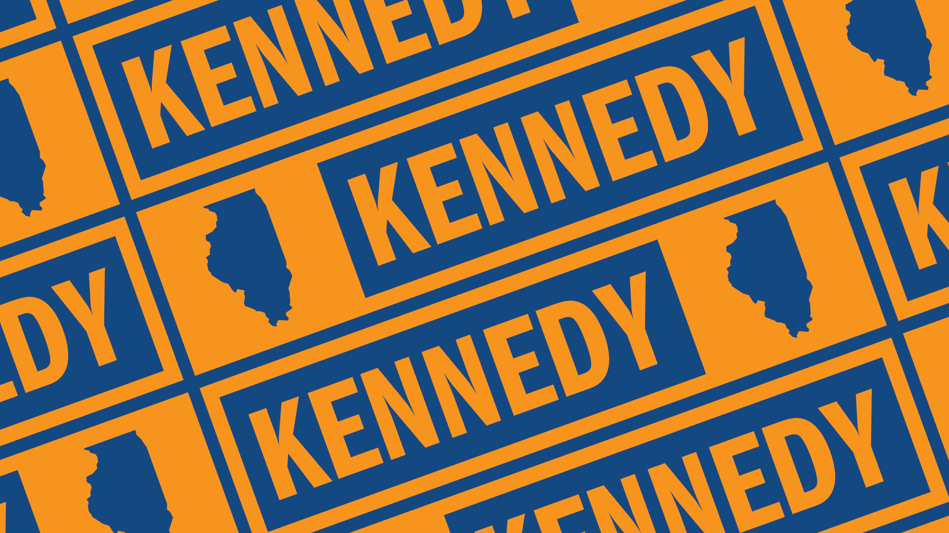
Kennedy
for Illinois
2018
Creative Director & Designer
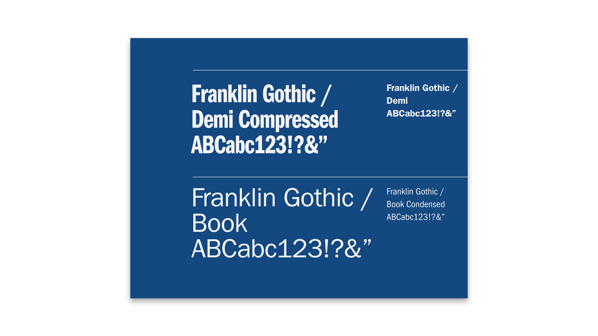
As part of an EPIC project, over the course of several weeks, we met with Chris and his team to develop an identity that embraced an attitude of candor and straightforwardness. One that leveraged the bold typographic treatments of past Kennedy campaigns, while using a contemporary palette that would stand out from your typical red and blue political treatments.
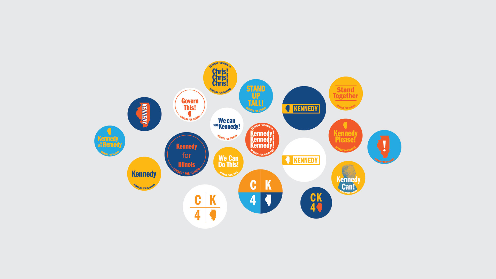
Although he didn’t win, there’s still some fun creative work that came out of this quick collaboration. Most of this however, never saw the light of day. It was interesting to see just how much design was needed – even for a smaller campaign – and with realistic budgets it’s simply not accounted for. Also, the pace that a campaign needs to operate at is at odds with a typical design process – there’s very little time for iteration – a lot of improvisational riffing. Without a dedicated team of skilled designers, it’s easy to see how the visual language of your typical campaign can yield the results they do. Lesson learned – stay away from political design.